[Editor’s note: On Dec 13, 2013, Howard Schlossberg gave a presentation to the FM-DiSC group on the subject of FileMaker 13 popovers, which was very well received, and which I’m proud to share here with his permission.]
An obvious idea is to use popovers for basic navigation — to provide record-related utilities and/or reports, for example…
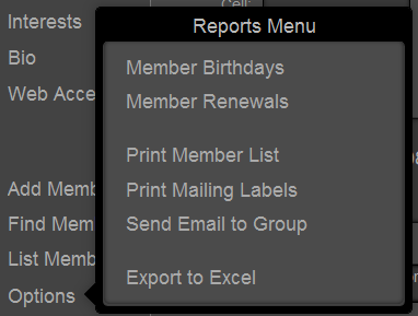
But you can add an invisible slide control to the popover so that clicking on “Member Birthdays”, for example…
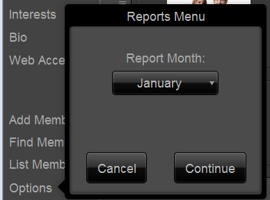
…slides to a different report criteria panel than “Member Renewals”.
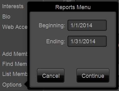
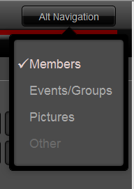
Popovers can handle navigation between modules or screens.
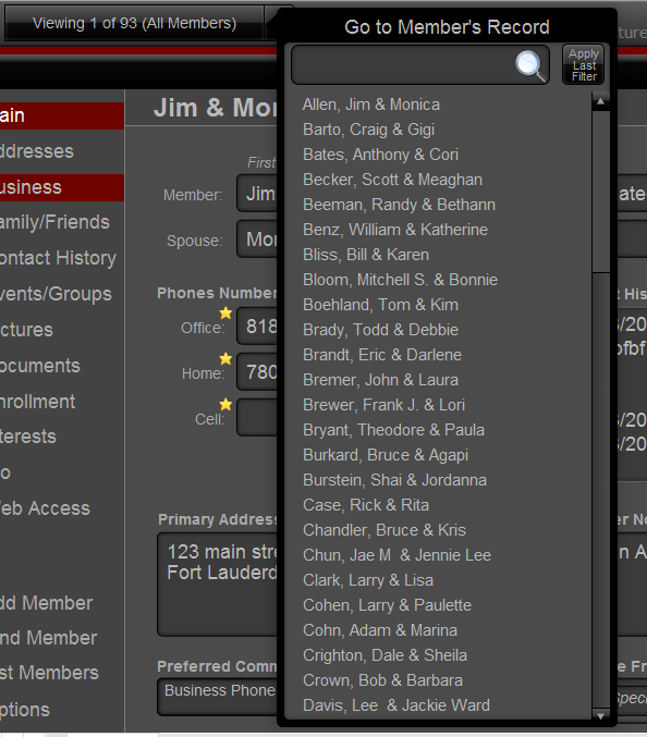
We can use popovers as an alternative to navigating between records (i.e. instead of going to list view and/or performing certain finds). Pop up the list, use the portal filter, and select the person whose record you want to go to.
Save space by hiding information that is occasionally helpful but doesn’t need to be displayed all the time. For example, on this member’s screen, we can click the “Member Name” field label to pop up that person’s picture.

Or instead of a portal full of data entry fields for related addresses, display only text and use a popover for the user to be able to edit fields (or add new addresses) for the specific address they want. It cleans up the layout and avoids you having to create a second layout and script to pop up a new window, go to the correct layout, resize the window, center the window, etc.

There’s no need to display a big block of check boxes when you can simplify the basic view and use a popover for actual data entry.

I could have used a “contact history” portal, but then new entries could only have been added either by scrolling all the way to the blank row at the bottom, or by clicking a button to pop up a 2nd window (see comment above about having to create a new layout and script the window).

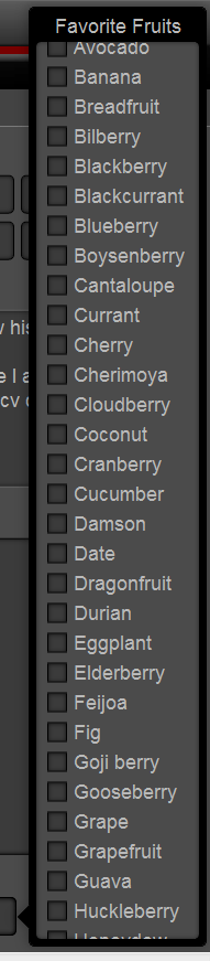
Your list of check box options is too long for the space provided? No problem. Put them in a popover, make the check box field as tall as needed, adjust the popover height to the space you have. You can now use your scroll wheel in browse mode to scroll through a check box list!
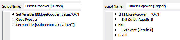
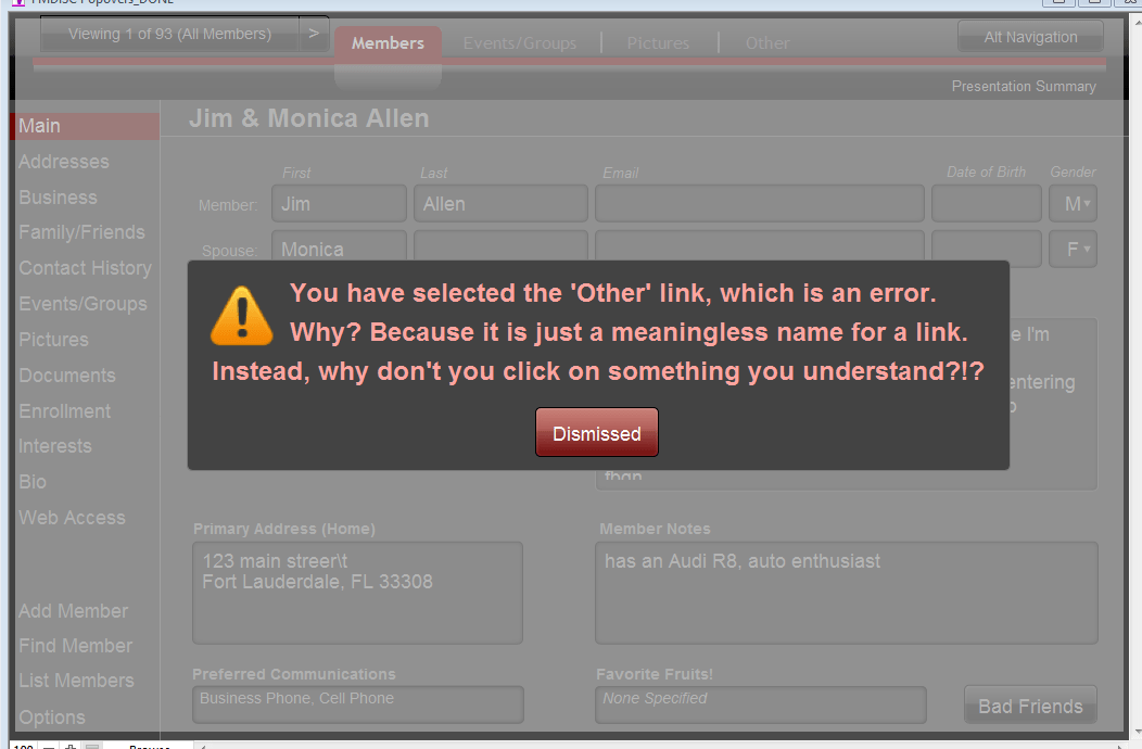
Put the popover across the entire layout with a semi-transparent fill. Draw a message box with your icon of choice. Users can’t click any underlying screen elements until they dismiss the message (which closes the popover).
[Update 12/16: it turns out that no matter how big you make the popover, it is still possible to click outside its edge to dismiss it. That’s not to say I wouldn’t use the technique where appropriate, and if necessary use script triggers on the popover to keep it from being “unofficially” dismissed.]
[Update 12/31: see addendum at end of this article.]
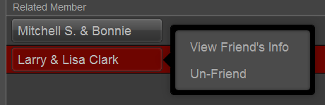
Too many little icon buttons on your portal rows? Remove them all and just add an Options “link” that opens a popover with all the available choices. In this example, the users would just click on a name in the portal.
In many cases, you can save going to another window by using a popover to add functionality. Windowing isn’t just a hassle to program for, but you lose “context” in environments like FileMaker WebDirect and FileMaker Go that don’t have windowing. Popovers keep it all in context.
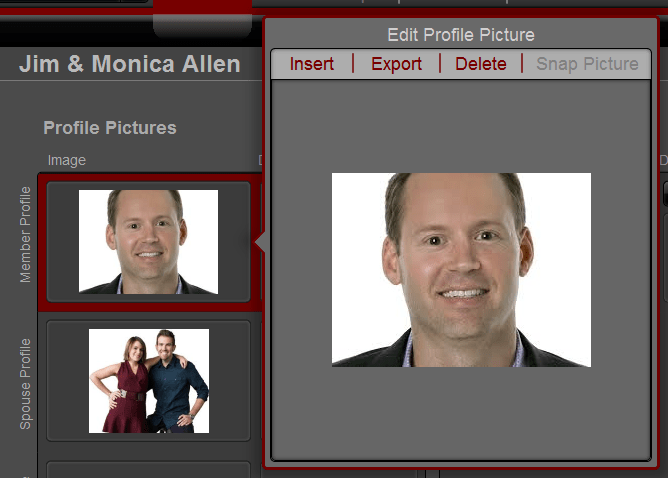
I’ve found in the past that a thumbnail can take a small amount of space, but the functionality required to support it (insert, paste, import, copy, etc) can end up taking more space than the photo itself. You can instead add a popover button behind the picture to show a larger version AND provide needed functionality. In this example, “Snap Picture” wouldn’t be grayed out for FM Go users, who can now take a picture directly into a container field. FM13 also provides a ton of metadata on your container files, which you could also use a popover to display on an “as-needed” basis.


- Apple’s UI guidelines for popovers on iPad. http://alturl.com/jehp6
[Addendum 12/31/2013: Script Triggers to Enforce Modality]
I couldn’t figure out a way to do this in just one script. It does work with these two scripts, where the “dismiss” button calls the first, and the popover’s OnExit calls the second: