Last time we examined some of the nuances of tab controls, both visible and invisible. Today we’re going to extend the exploration to include simulated and, in demo 5, genuine tab interfaces for layout navigation.

Today’s demo files:
- Tab Panels – Seen, Unseen, etc, v1
- Tab Panels – Seen, Unseen, etc, v2
- Tab Panels – Seen, Unseen, etc, v3
- Tab Panels – Seen, Unseen, etc, v4
- Tab Panels – Seen, Unseen, etc, v5
What you will see in demos 1 through 4 are not tab controls, but simulated folder tabs used for navigation purposes. Like many FileMaker developers, I tend to reuse things from project to project, and recently it dawned on me that I had been building my faux tab interfaces in much the same way for nearly 20 years.
Given the new design surface in FM 12, it was time to take a fresh look at how I was doing things. But first let’s take a look at the old method.
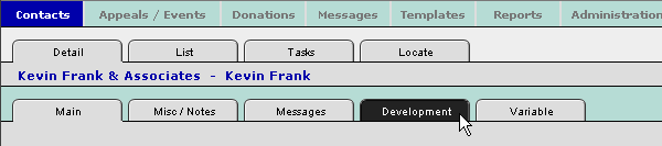
Demo 1
Note the selected rectangle object below… I call it a “retaining wall”.
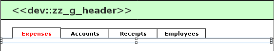
If we slide the retaining wall down, we see that each “tab” is a white rectangle.

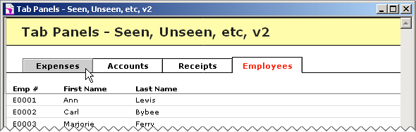
The four rectangles began life as buttons, because I wanted the embossed outline, but I didn’t want the entire button to become highlighted when pressed (i.e., the pre-12 behavior), so I ungrouped to remove the button definition. Note that the foreground Expenses tab is placed in front of the horizontal black line (a.k.a. “horizon line”), but the other three rectangles are behind it. Additionally, I placed a 2-point “border buffer” (white line) over the bottom edge of the Expenses tab.
Also, I was having trouble getting the labels positioned properly, so I removed them from the erstwhile buttons, and placed them on top as independent text objects, as per “Receipts” below.

And since I only wanted the “above-the-horizon” portion to highlight when pressed, I placed a clear rectangle (a.k.a. “button mask”) over the visible area of the tab, and defined that as the button. You might think I would have been able to simply resize the background of the text label, but, at that time, I could not get the alignment of the label within the block to cooperate. So, I went with a separate invisible rectangle.
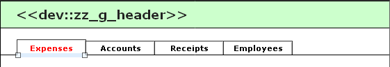
And to recap, here’s how it looks in browse mode.
Whew, what a lot of work to create a halfway decent illusion… and that was just for rectangular tabs. It was even more work if one preferred rounded corners on one’s tabs…
…in which case one would overlay a series of clear horizontal lines (shown in red here) of increasing width, to approximate the curve, group them, and define the group as a button.

I used the term “illusion” a moment ago, and for the illusion to be seamless there can be no awkward shifting of screen elements as the user navigates from layout to layout. The simulated tab control must appear to be rock solid. If you’re switching between form (e.g., Expenses) and list (e.g., the other three) layouts, you may want to use a three point layout offset like the one shown here: What’s Right With This Picture?
Demo 2
At any rate, here we are in the FM 12 era, and demo 2 showcases the simplified method.
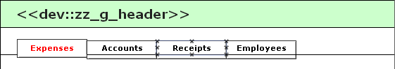
Each tab is a 100 x 27 point button, with the text centered both vertically and horizontally. The foreground tab line spacing height is set to 16 points…
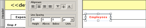
…and the background tabs are set to 19 points, ensuring the text labels on all tabs will line up perfectly.

The “pressed” style of the buttons is assigned via the Inspector, and note that in FM 12, styles only apply to the visible portion of the buttons, so no separate “button mask” is necessary. (That’s a major change from the pre-12 behavior, where the entire button would highlight when you pressed it.)

We still need the “horizon line”, “retaining wall” and “border buffer” we saw in demo 1, but clearly this method has fewer moving parts than its predecessor, and from a UI standpoint is equally effective.
Demos 3 & 4
So what if we want to restrict layout access based on user privilege? In the remainder of today’s demos…
- Managers are allowed to access all layouts
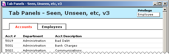
- Employees are allowed to access the “Accounts” and “Employees” layouts
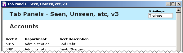
- Trainees are only allowed to access the “Accounts” layout
Demos 3, 4 & 5 have accounts, passwords and privilege sets like so:

(Note that there is no Admin account. The full access acccount is Manager/Manager.)
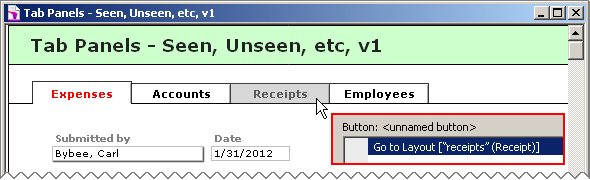
Of course we aren’t going to rely on the user interface to enforce security. Here are Custom Record Privileges for the Trainee privilege set:

And here are Custom Layout privileges for Trainee…

…and the Employee privilege set is similarly configured. So whatever we come up with at the layout level will just be UI icing on a solidly secure cake.
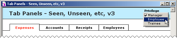
Demos 3, 4 & 5 are configured to auto-login as Manager (reminder: this is the [Full Access] account), but you are welcome to re-login manually, or via the Privilege popup menu…
…which triggers this script.

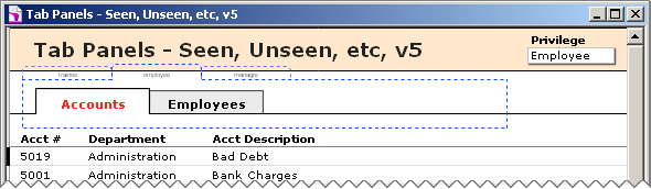
Here’s what we see when we log in as Employee…
…and here’s what we see when we log in as Trainee.
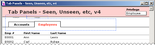
Demo 4 reveals what’s going on behind the scenes…

…an invisible tab control with three tabs corresponding to the three privileges. This is essentially the same technique that was explored at length in my previous article so I won’t go into detail here (except to reiterate that when the tab controls are actually invisible, there will be nothing to click, and they will only be navigable via the “Go to object” script step).
Since the Expenses and Receipts layouts are only accessible to Managers, we don’t need to use invisible tab controls there. The only place we need them are on the Accounts and Employees layouts. Also, since Trainees do not have access to the Employees layout, we only need two tabs on this layout’s invisible tab control.
Demo 5
Demos 3 and 4 use a combination of invisible tab controls and visible simulated tab controls. Can we dispense with the simulation and use visible tab controls to drive the layout navigation? Yes we can. Our final demo of the day shows this technique in action. And of course one big difference is that tab controls fire on mouse down, whereas buttons fire on mouse up, so the navigation will feel snappier.
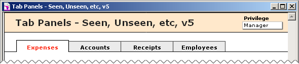
As per demos 3 & 4, only Managers are allowed access to the Expenses and Receipts layouts, so we don’t need to use invisible tab controls on either of those. But here for the first time, we are using a genuine tab control to drive layout navigation, and this works thanks to an OnTabSwitch trigger…
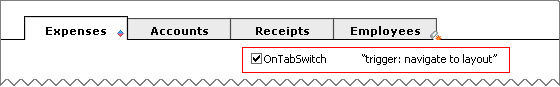
…which invokes this script (yes, there are more elegant ways to handle navigation; we’ll get into that another time).

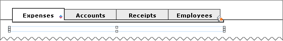
Since I only wanted the foreground tab to have a red label, I applied conditional formatting to that tab.

We still need a “retaining wall” to obscure the body of the tab control. Here’s what we see if we slide it down.
As per demos 3 & 4, we use an invisible tab control on a couple of the layouts to flexibly determine which visible tabs the user sees.
And I think that’s enough for today.