 Today we’re going to look at applying the virtual list technique to FileMaker charting with the goal of producing a reusable chart “object”, or rather, a series of chart objects. We’ll need more than one because while certain attributes (e.g., chart title) can be set programmatically, others, including type (e.g., column or line), must be hard-coded into the chart object.
We’ve already explored Bruce Robertson’s virtual list on this site a number of times, but briefly, you create a utility table in your solution to facilitate non-standard viewing, reporting, etc., and pre-populate it with “more records than you’ll ever need”. The records in this table will derive their data “virtually”, by parsing it from an array — typically one or more $$variables.
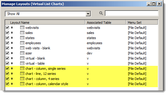
Well it turns out the technique can be applied to charting as well, and today we have a demo file, Virtual List Charts, that contains six examples: three for Web Visits…

…and three for Sales Data.

Structure of the Demo
We’ll get to the charts in just a moment, but first let’s take a look under the hood. Here are table definitions…

…and here’s the basic structure of the Relationships Graph.

As you can see, webvisits are related to states via the “st” abbreviation, and sales are related to employees via a standard foreign-to-primary-key relationship.
Charts will be produced from the “virtual” table, and note that the table occurrence is named “v”, and that “v” is not related to any other table. The “break” field will be used for sorting purposes, and, in one case, to provide a report-style subsummary header. And if you’re wondering about v::serial, as its name implies it’s a standard serial number, i.e., 1 for the first record, 2 for the second record, 3 for the third record, etc.
And here are the layouts, with chart layouts highlighted.
The Basic Idea
We’re going to use Mikhail Edoshin’s Fast Summary technique to slurp up summarized values from Web Visits and Sales Data, and push those values into $$variables, or, more accurately, $$variables[withReps], which will be parsed by the virtual table with v::serial corresponding to the $$variable[repNumber]. Each variable repetition number will correspond to a chart, and (with the exception of Example #6, which we’ll see in part 2) each chart will correspond to a record in the virtual table.
If you’re already familiar with the virtual list technique the preceding paragraph probably makes at least some degree of sense; if you aren’t and/or it doesn’t, don’t worry, things should become clear as we explore the examples.
As I said at the outset, the goal is to be able to treat charts as reusable objects, but another goal is to be able to easily generate multiple charts at one shot, including, as we’ll see in the demo…
- separate charts for each year
- or for each state
- or for different time periods
- or two different interpretations of the same data
Chart Setup
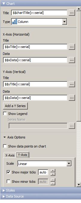
All charts in today’s demo are based on “Current Record (delimited data)”…

…and the delimited data will be assembled in these $$variables[withReps].

All of the chart types in the demo are either “Column” or “Line”, and the chart setup will look like this, or some variation thereof. Remember this is a reusable object, so the optional titles ($$xTitle and $$yTitle) are defined whether we populate them or not. If we leave them empty, no harm done, they simply won’t display.
Example #1 – web visits: column charts for each year

In this example, we want to generate a separate chart for each year, with 12 columns representing the monthly web visits for January through December.
 We don’t care what state the visits are coming from, we just need to produce one chart per year, with 12 columns per chart. Assuming we run this demo in the year 2014, we will end up with nine charts, for the years 2006-2014 inclusive.
The web site went live in March 2006, so we don’t have any data for January and February of that year, but for the sake of consistency we want all 12 months to appear on every chart, whether we have data for a particular month or not (thereby ensuring uniform column widths and standardized monthly column colors) .
Stated more generally: when producing multiple charts for comparison purposes, we want to make sure the labels on the x axis are the same for every chart, and if there are any “gaps” in the data, we want to make sure they appear in the correct location.
Below we’ll look at a specific method to ensure this happens, but for the moment let’s just agree that it’s always a good idea to…

(In case you’re curious, here’s what neglecting to mind the gap can look like…)

Here are the variables we’ll be concerned with in this example.

Why did I decide to use global ($$) variables, as opposed to local ($) variables? While it’s true that you can use $variables in charts, I’ve found that the pros of using $$variables (persistence, ease of debuggability) outweigh the cons (needing to clear them out between chart runs), especially since I can quickly and easily zap them with the help of a custom function, ClearRepeatingVariable.

(This CF has two companions — SetRepeatingVariable and JoinRepeatingVariable — whom we’ll encounter below.)
Okay, let’s take a look at the chart generation script. At the outset the user is asked whether they want their charts to be sorted by ascending or descending year…

…and based on the user’s response, a $sortDir variable is set to either “ASC” or “DESC”, and will be utilized at the end of the script. Next, we take care of some preliminary details, including initializing the $serial variable with 1, and locating a set of records to report on.

The demo has test data through the end of the year 2015, but pretends not to know about the future (hence the “<= $dateToday” search criterion). And incidentally, if you wish, you can create additional entries by running either of these scripts:

The next section is where the magic happens — we have two loops: an outer one to walk the years, and an inner one to walk the months, and as we iterate through the outer loop, we push each year into a new repetition for $$breakField (as per the green highlight).
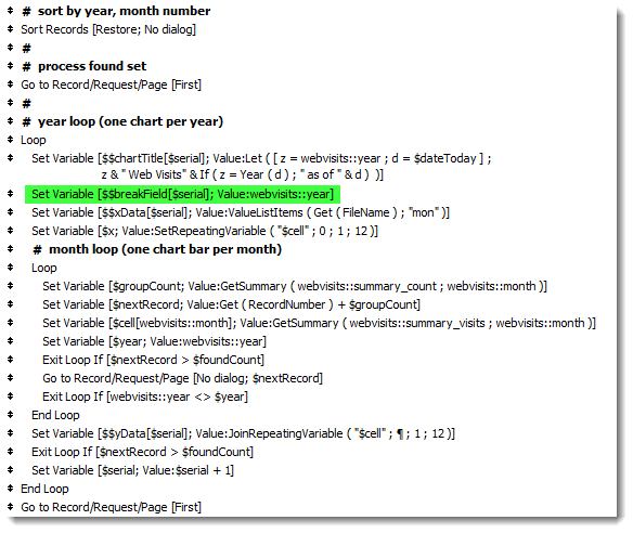
Note also that the $serial variable is incremented with each iteration of the outer loop. So if we produce nine charts, $serial will equal 9 when we exit the outer loop.
And since we’re producing nine charts, there will be nine reps for each variable (shown here in the Data Viewer are $$chartTitle and $$yData), and the two leading zeros in the tooltip indicate that we have “minded the gap” for January and February 2006, …

…with help from the two custom functions highlighted in yellow here.

In a nutshell, for each outer loop iteration (i.e., for each chart) SetRepeatingVariable loads up $cell[1] through $cell[12] with zeros, then the inner loop sets each $cell[rep] to a proper value where [rep] corresponds to a given month number. This way, we can grab monthly totals for months we have, and there will be a zero placeholder for any month we don’t have.
Then JoinRepeatingVariable (a custom function by Sam Barnum, which was previously discussed here in July 2011) assembles those 12 individual $cell[reps] into a single return delimited list to be inserted into the appropriate $$yData[rep].
What about $$breakField[rep]? Here it is in the Data Viewer…

…here’s the definition of the “break” field in the virtual table…

…and here’s how it will be parsed by the virtual table:

Finally, the script assembles a found set of records in the virtual table, displays the charts and sorts on the break field as per the $sortDir variable that was assigned at the outset.

And if we run this routine on 25 April 2014, and we specify an ascending year sort, we end up in the virtual table with a list view of nine charts, the bottom two of which look like this:

Well, we’ve covered a fair amount of virtual list charting territory, and introduced a number of concepts here in Example #1 which will apply to all the remaining examples… and we will explore those examples in part 2.
Can this technique be adapted to chart users selected years? For example, if the user specified that they only wanted the data for 2009 and 2013.
Hi Jeremy,
Absolutely… constrain the found set to just the years you want to report on. The routine reports on the actual years present in the found set (see the image with the green highlight on $$breakField[$serial]).
Regards,
Kevin
Much appreciated! I’ve been looking for a solution similar to this for quite a while now. One other question: Is it possible to chart the data for multiple years in a single chart?
Hi Jeremy,
Yes, it’s quite possible. What you’re asking for (and what we did not see here in part 1) are multiple data series for the Y axis.
Part 2 has some examples of this.
Regards,
Kevin