About the author: Beverly Voth has been in the Claris FileMaker community many years. In addition to FileMaker Pro and its integrated products, she is a Full Stack Web developer & SQL database administrator. The only recipient of the FileMaker Excellence Award for Outstanding Contribution to the FileMaker Web Publishing Community (DevCon 2003), she’s been advocating Claris FileMaker and web since they could work together.
This is part three of a series on the new Claris platform. We introduced the overview, Claris Studio, Tell Me More! on 29 September 2022, and Claris Studio (part 2) – Integration with Claris Pro on 12 October 2022. This article gets into more details on the different types of views in Claris Studio. Since the spreadsheet view will likely be a most common usage for many, this article will be devoted to it. The spreadsheet view in Claris Studio has plenty of goodies & features, and can be used to create Dashboard views (charts and summary text).
Claris Studio, Spreadsheet View
Of all the views available in Claris Studio, the spreadsheet is a very flexible table for data entry & editing, sorting & grouping. These web-based data grids (tables) are more robust than FileMaker/Claris Pro table view, better than web viewer data tables (easier at least!), but probably not as full-featured as Excel or Numbers spreadsheets. There are no “cell” formulas or references as in some spreadsheets, but there is a way to present a grid of rows & columns for data entry, viewing, and reporting. Web-based data grids may use methods that allow drag-and-drop re-arrangement of rows and/or columns, as you will find in Claris Studio’s spreadsheet. There are several JavaScript & CSS techniques & frameworks or libraries used for tables on the web. Many of them have been integrated into FileMaker Pro (and now Claris Pro) though Web Viewers.- Spreadsheet.js (https://spreadsheet.js.org/)
- SheetJS (https://sheetjs.com/)
- CloudTables (https://datatables.net/examples/data_sources/js_array.html)
- npm, Datatables plug-in for jQuery (https://www.npmjs.com/package/datatables)
- AppML Brings Data to HTML (https://www.w3schools.com/appml/default.asp)
- more when you start searching!
Spreadsheet view features
- When you create a new spreadsheet these default fields/columns are created for you: First Name, Last Name, Email, Comments. These default fields can be renamed or deleted from the table.
- You may add or remove columns of these field types: Short Text, Long Text, Number, Drop-down (selection option), Checkboxes (selections), Single Choice (radio selection), Date, Time, Timestamp, Phone, Email, Signature (graphic), & Attachment (graphic/file). The Address type is a special block type and adds several named text columns at once: Address Line 1, Address Line 2, Suite, City, State, & Zip. New as of 18 October (Claris Studio Help: What’s New) are two more types: User & Currency. See below for details.
- After your spreadsheet is set up, you can create these views from the same table that the spreadsheet view uses: Form, List-Detail, Kanban, & Dashboard. NOTE: Member users cannot create views.
- As of the 18 October 2022 update, you can no longer share the spreadsheet view with anonymous users. You can, however, add spreadsheet views to hubs and invite users. Only Managers can create dashboards, but Members can do everything else, including: add/delete fields/column & records/rows. Login to Claris Studio requires Claris ID for all users to work with spreadsheet view.
- You may also view the data (and edit) when the table created for the spreadsheet is shown as a shadow table in Claris Pro. Records can also be added or deleted in Claris Pro, but the schema (columns/fields) cannot be altered in this shadow table.
What’s in a name?
Before we deep dive into the spreadsheet view, we may need to define a few terms used when talking about fields and columns. These may refer to the spreadsheet or other views.- Name (of field or column, depending on where you use it) can be changed in spreadsheet view (easily on the column header, by popover dialog) or on any view with the sidebar (click on the name to change it). This is the name that should appear in the shadow table in Claris Studio.
- Label (text that shows above the field entry on the form-type view) is not necessarily the same as the name.
- Placeholder (text that shows inside the field in a form-type view) is also not necessarily the same as the label or name.
- Default (value that is auto-entered into a field/column, any view) is shown instead of placeholder, if there is a value (as defined).
- Description (shown in spreadsheet view only) is similar to a comment on a defined field in FileMaker/Claris Pro. There is a little black circle-i next to the field name in spreadsheet view only. This description is not shown in the field of the shadow table as a comment, however.
- Required (form-type fields only) means the form cannot be submitted, if the value in any form field is required, but empty. On the form if the field is required, the “*” is placed after the label. Click on the gear icon in a form-type view to see the required checkbox. In the form view you can quickly toggle all fields as required (or not), by clicking the gear above the header. Setting this toggle on the form does not make the field required in the spreadsheet or other views.
- Type (used when the field or column is created in some views). This may be the “field name” in the Claris Pro shadow table instead of the name. This should be fixed in the future.

Step 1: Create a new Spreadsheet View
From the Views page, click on the “+ Create New View” drop-down and choose spreadsheet. You will get something like this:
What is the top menu of the Spreadsheet?

- The first menu item is a drop-down that allows you to: Rename Table & Edit Description. This new table name is what will be shown if you add the shadow table to Claris Pro. The description is optional, but will add a small black circle-i next to the table name, if you add one here. TIP: rename the table so you will know what it is in Claris Pro, otherwise the name is a unique ID, but not at all descriptive!
- The second menu item lets you add Filter conditions, to allow you to “narrow your found set” by: selecting the conditions (all or any), selecting a field, operator on that field, and the criteria for the filter. Multiple filter conditions may be set per spreadsheet.
- The third menu item let’s you set up rules to Group your column(s). Multiple group rules may be added and once set, the table is sorted (grouped) with a summary count (of the rows in the group) as a new row in the spreadsheet. The new row cannot be edited, but has some special properties (see Add/Edit Rows and Cells, below).
- The Sort menu item is sorting rules, but does not add rows or show counts like Group. Multiple fields (one per rule) may be added.
- The Search box allows you to enter text & works much like Quick Find in Claris Pro. Any visible row and/or column can be searched and the cell (intersection of row and column) will highlighted if there is a match.
- The Columns drop-down allows you to show/hide each column/field (or all fields). This only removes it from the current table view, but does not delete it. When you edit the record the hidden fields can still have data entered into them. More about row features, below!
- Create Dashboard is the only place in any of the views that allows you to choose Charts & Summaries based on the data in your spreadsheet. A new spreadsheet with no data rows will allow you to create the dashboard, but it may need to be edited once you enter data. The created dashboard will be shown as a new view with the same related table. More about Dashboards will be detailed in this article. This menu item is not shown for Member users, only for Manager users.
- Table Actions has a drop-down to: Import from CSV, & Download as CSV. Initial testing only allowed 50 rows to be imported and there is a “mapping” dialog to match the CSV header row to the columns/fields in your Spreadsheet. Only the same data type can be mapped.
- The (gear icon) Density menu item allows you to change the row height: Compact, Medium, or Comfortable. This allows you to see less or more data in a row of cells based on that row density (height) for the entire spreadsheet.
Step 2: Add columns/fields
When you click the “+” at the end of the column header “row”, you may add new fields. The chart below shows the field/column/object type in Claris Studio. The notes column shows web form equivalents (if any) & options on display or validation (if any) of the object type. These are the same object types as on other views. In the spreadsheet, when you select the object to add, you get the Configure Field dialog. Notice how this can be different depending on the object type. When you edit any column, there is a different drop-down menu to allow you to edit the configuration. The column options will show the options in the configure or edit dialogs. Options for the cells is in the next table, including: how this field/column/object type maps to Claris Pro fields, and the summary field(s) options. This chart has some Configure Field dialogs (newly added column) and some Edit Field dialogs. The “Add Column” button in the dialog changes to “Save”, after the column has been created but now is being edited.CHART 1
| field/object type | notes | configure/edit field | column options |
|---|---|---|---|
| Short Text | This is input type='text' in web forms. | 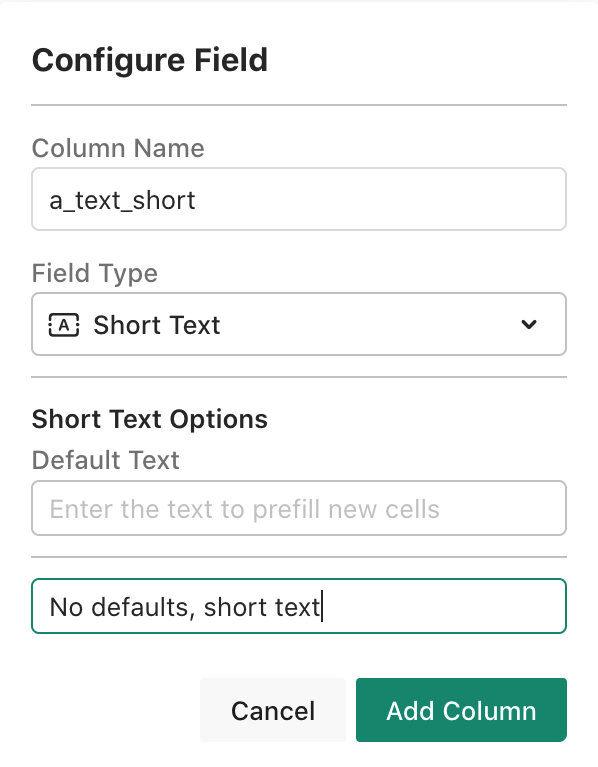 | N/A |
| Long Text | This is the textarea in web forms. It resizes (height) on Claris Studio Forms. |  | N/A |
| Number | This is input type='number' on web forms. |  | Number Options - format:
|
| Drop-down | This is a select object in web forms with options. New 18 OCT update is the ability to have a Custom List or values from Another View. |  | Drop down options:
|
| Checkboxes | This is input type='checkbox' on web forms. |  | Selection options may be edited, added, or removed. |
| Single Choice | This is input type='radio' on web forms. Selection will be radio button and only one can selected. |  | Add, edit, or delete options. |
| Date | This is input type='date' on web forms. |  | Date Format:
|
| Time | This is input type='time' on web forms. |  | Time Format:
|
| Timestamp | This is input type='datetime-local' on web forms. |  |
|
| Phone | This is the input type='tel' on web forms. Validates on entry, with this display format (Form View only):
|  | Default Value:
|
| This is the input type='email' on web forms. A default value may be added when configured, & the field validates upon entry. |  | Default Value:
| |
| Signature | This may require JavaScipt & CSS to create a "signature" field for web forms. |  | In any form-type View (only), this object type options are:
|
| Address block | This is a group of input type='text' fields on web forms. If you add an Address column/field to any View, you get several text fields. |  | N/A |
| Attachment | This is input type='file' on web forms. | 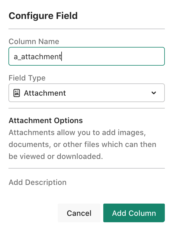 | N/A |
| Currency | Format options only, as text field, does not summarize like a number. |  | Currency Symbols: $€£¥₩₹ |
| User | This is a selection list (not available on Shared Form View) of invited Managers and Members. This drop-down shows the name and email, but the name only is displayed upon selection (as colored highlight). |  | N/A |
Tips:
- If you make changes in this spreadsheet for columns, you may need to Sync the table in Claris Pro once it is already a shadow table there.
- If you make a very long column/field name, it will be truncated if shown in a form-type view on a mobile devices, so test! If there is a CSS-fix later, this will not matter.
- The column/field names are in the download CSV, so keep that in mind as well.
- On the forms, if you use any of these fields, remember that you have the option of creating a label and placeholder text, so the length of the field name doesn’t matter as much. Keep the label short for form viewed on mobile devices.
- And as of this article, there is a bug in the column names, where the field/object type is shown as the field name in Claris Pro rather than the column as you named it.
- Columns may be re-arranged as well as hidden. Use drag-and-drop to rearrange, or click the column name for the drop-down menu with more features, such as moving the column.
Step 3: Add/edit Rows and Cells
There are properties on rows and cells that make this spreadsheet view really powerful. You may rearrange rows as well as columns with drag-drop. This is not sorting, but actually moving a row of data to another position on the spreadsheet. The columns in this chart are: the field/object type, column menu, summary options, & Claris Pro field type. Some of the column menu dialogs change based on the field/object type. For example you cannot Chart by field name for long text, or by any field if you are a Member user. The summary options for the field type may be used in the column summary row, grouped-summary row, and in some dialogs that summarize the data. The Claris Pro field type shows what the constraints are on this type of field. If you print the fields in the shadow table to PDF, these are the type and formula/entry Options.CHART 2
| field/object type | column menu | summary options | Claris Pro field type |
|---|---|---|---|
| Short Text |  |
|
|
| Long Text | (image not available) Long Text does not grouped, & cannot be charted, for example. |
|
|
| Number |  |
|
|
| Drop-down | Same as Short Text |
|
|
| Checkboxes |  |
|
|
| Single Choice | Same as Short Text |
|
|
| Date |  |
|
|
| Time |  |
|
|
| Timestamp |  |
|
|
| Phone |  |
|
|
 |
|
| |
| Signature |  |
|
|
| Address block | All fields in the Address block object are the same as Short Text. |
|
|
| Attachment |  |
| N/A - attachments (containers) are not shown in Claris Pro at this time. |
| Currency |  |
|
|
| User |  |
|
|
Edit Rows/Records
To edit the row, hover on the row number and click on the icon to the right of the number. You will get a pop-over dialog with the fields to edit, including a section for the hidden fields. In addition you can Add a New Field here:

A Special Row (Summary)
The summary row at the bottom relates to the column/field type and changes based on that type. See the 2nd chart above with the summary options on each field type. Some types don’t have a summary option, such as long text or signature. These options are the same ones used on the dashboard summary types. The ∑ symbol with the number tells you the number of visible rows, similar toGet(FoundCount) in Claris Pro. This changes as you filter the spreadsheet, but collapsed grouped-summary rows will be the number of data rows, not the number of spreadsheet rows.
Filters, Groups, & Sorting
The Filter is a way to narrow the rows of data, by setting conditions for that filter. You may have more than one filter.


Step 4: Dashboards with Charts and Summary Text
Dashboards can be created from the top menu on a spreadsheet, Create Dashboard, but only by Manager users. If you studied the column menu in the 2nd chart, you’ll see that many of the columns can be used to “Chart by…”. Dashboards allow these objects:
Chart Types
There are three chart types that can be configured from the data in the Spreadsheet: Pie, Bar, Line. These may have different options, so study the dialogs carefully (showing Line and Pie chart dialogs):


 The Summary Type drop-down matches the column type, so check the 2nd chart above for “summary options”. There is a sample dashboard view showing several chart and summary object when you first start using Claris Studio. Tip: do not delete the view, but use for samples of how to use these objects.
This is not a complete detailed tutorial on the spreadsheet and dashboard views in Claris Studio. Something is left to explore on your own. In addition, don’t forget to check for updates to Claris Pro & Claris Studio, as what you read here may or may not have changed!
Next up: Form View (some very cool flow actions – conditionals!), List-Detail View (a form but with all records shown, to be filtered and/or sorted, as desired), and the Kanban View (really a special arrangement of the data in the table). And perhaps we will explore a little about Claris Studio security as well!
The Summary Type drop-down matches the column type, so check the 2nd chart above for “summary options”. There is a sample dashboard view showing several chart and summary object when you first start using Claris Studio. Tip: do not delete the view, but use for samples of how to use these objects.
This is not a complete detailed tutorial on the spreadsheet and dashboard views in Claris Studio. Something is left to explore on your own. In addition, don’t forget to check for updates to Claris Pro & Claris Studio, as what you read here may or may not have changed!
Next up: Form View (some very cool flow actions – conditionals!), List-Detail View (a form but with all records shown, to be filtered and/or sorted, as desired), and the Kanban View (really a special arrangement of the data in the table). And perhaps we will explore a little about Claris Studio security as well!
Group Tips:
• When you group column(s) they become like having “Freeze Panes” in some spreadsheets. Scrolling (left/right) will leave the group visible while the other columns only show in what is left of the screen width!
• However, grouped fields/columns cannot be manually re-arranged or hidden.
Hi Bev. Have you seen a way yet to adjust the width of the columns in a spreadsheet? If not, it would be a good item for the wishlist. Thanks for the article!
Sure, Marc! Like many spreadsheets, you can hover mouse between columns (in the header) and see the cursor change to allow resizing. There are a few tricks I have not found. And there are some I found that didn’t get into the article, so thanks for asking!
Ah yes, I see that working now with Claris Studio and Chrome! I can’t seem to get it to work with Safari on a Mac, however. I just updated to the very latest Safari/Ventura yesterday. Nice to see it working on Chrome at least. I’ll chalk the other up to a bug or user error and continue to investigate…
Thank you for the feedback. I have been using Firefox browser on MacOS (not Ventura). What I use seems to be effective. We’ll see what the consensus is on browser (what works/doesn’t).
For what it is worth…
In Safari, if you click into the column first, you can then click and drag a column to resize it. The key is clicking into the column first.
Thank you for the Tip!
– Beverly