If you are responsible for helping business decision makers analyze data, you are probably familiar with questions like:
- Are we on track to meet or exceed last year’s sales totals?
- How is our sales team doing now, compared to this time a year or two ago?
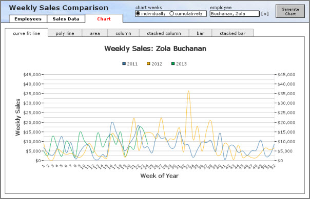
Today’s demo file, weekly sales comparison charts, v3, can help answer these questions. It consists of an Employee table with 20 records, a Sales table with approximately 40,000 records, seven chart types, and an option to chart weekly amounts either individually or cumulatively.
When we look at the weeks individually, it’s clear that Zola Buchanan’s sales figures are mixed so far this year, compared to 2011 and 2012. But what may not be immediately apparent is whether overall she’s doing better, the same, or worse.


